What are CSS Grid Containers & How do They Help in Having a Responsive Design

Author : John Prabhu 18th May 2020

The CSSCSSCascading Style Sheets is a style sheet language used for describing the presentation of a document written in a markup language like HTML. CSS is a cornerstone technology of the World Wide Web, alongside HTML and JavaScript. CSS Grids containers are available in the browsers since 2017 and they are mainly used to attain responsive front-end design. Also, you might be confused as there are new CSS properties and values associated with the CSS Grid Layout. It is possible that you wouldn’t have got enough chances to practice them on real-time projects. Hence, we are illustrating some of the CSS grid concepts with practical usage tips.
We will be taking a detailed look on display: grid, display: inline-grid, grid-template-columns, grid-template-rows, grid-auto-columns, and grid-auto-rows. Firstly, let’s take a look at creating a grid container and then experiment applying CSS grid properties to it.
Creating a Grid Container
Grid is nothing but a value to the CSS display property, which is used to tell the browser you want to use the grid layout. Now, the browser will offer you a block-level display for the element with display: grid and all its child elements will fall under the grid format. Hence, they behave like grid items and not normal block or inline elements.
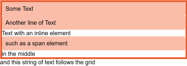
After creating a grid, you may not witness immediate changes to your web page. Firstly, you will have only one column grid and it houses enough rows to hold the child elements. All your child elements are stacked one below the other in the single column and they look like block elements. You can witness some difference when you have a string of text, not wrapped in an element, and a direct child of the grid container, as the string will be wrapped inside an anonymous element and become a grid item.
Hence, any inline element such as <span> will fall under the grid format if its parent element has the display: grid property. Below is an example showing two block-level elements and a string with a <span> in the middle of some text and some text after the <span> element.
See the Pen 1. CSS Grid Container by Hanush (@hanushk) on CodePen.
With the help of Firefox grid inspector, you can witness five-row tracks that has been created for the items as shown in the image below
Another way to create grids is to use display: inline-grid property. Unlike block-level box, in this scenario, your grid container is an inline-level box. As a result, the grid boxes don’t occupy the entire length of the available space. Moreover, the child items still fall under grid and function as a grid item in block-level box. Therefore, the container behaves just like the grid container example we saw above when it alongside other boxes on page. Below is an example to illustrate the same.
See the Pen 2. CSS Grid – Inline Grid by Hanush (@hanushk) on CodePen.
Columns & Rows
To witness an actual representation of a grid system, you must get into rows and columns and play around them. You can use grid-template-columns and grid-template-rows properties to create the required columns and rows. Below is some of the track-list for your reference:
grid-template-columns: 50px 50px 100px;Creates a three-column grid: The first column is 50px, the second 50px, the third 100px.
grid-template-columns: max-content min-content fit-content(5em);Creates a three-column grid: The first column is the max-content size, and second is the min-content. The third is either max-content unless the content is larger than 5em, in which case it is clamped to 5em.
grid-template-columns: 1fr 1fr 1fr;Creates a three-column grid and whatever space available in the grid container is divided into three and shared between the three columns.
You can check more of the track-list here.
Using Length Units
Experiment with all the length units available on CSS and find your sweet spot. If your grid container has less space than the size of your tracks, then your tracks will automatically align themselves to the start of the grid container and the excess space will go to the end. It happens due to the default value of justify-content and align-text properties, which is start. Also, you can move the grid tracks to the end or space them out using alignment properties.
See the Pen 3. CSS Grids: Length 1 by Hanush (@hanushk) on CodePen.
Also, you can use keywords such as max-content, min-content, and fit-content() if you don’t want to go with the percentage or pixel based lengths. The min-content will offer a track that is smaller in size and avoids overflow. As a result, whenever you use it to define a column size, it will softly wrap and prevent overflow. The track adjusts itself to the largest fixed-size element or largest word in the column.
In max-content, you don’t get the privilege of soft wrapping at all instead any string will unwrap and overflow. When using fit-content you must include a value so that unless the track stretches enough to hit the specified value, it will act as max-content. As a result, it will unwrap & overflow. After reaching the point, it will start to wrap as usual. Hence, your track may be smaller than the specified value, but it won’t be larger.
See the Pen 4. CSS Grid – Length 2 by Hanush (@hanushk) on CodePen.
When your tracks consume more space than available in the container, the tracks will overflow. When you go ahead with percentages (either percentage-based float or flex layouts), ensure the total percentage is not more than 100 to prevent overflow.
The fr Unit
Grid Layout comes with a method & can save you from calculating percentages for yourself with the help of fr unit. As fr isn’t a unit of length, you can’t club it with calc(). It is only a flex unit and represents the space offered in your grid container.
When you come across a track-list with 1fr 1fr 1fr; the grid container space is equally divided into 3 parts. If the values change to 2fr 1fr 1fr;, firstly, the grid container is divided into 4 equal parts. Secondly, the first two parts are clubbed together to form a single track-list and the other 2 parts are let to be individuals. Hence, the first column will be double the size of column 2, and column 3.
See the Pen 5. The fr Unit – 1 by Hanush (@hanushk) on CodePen.
Here comes the tricky part: remember, the space shared out by default is the available space and not the total amount of space offered in a container in the first place. In case your tracks contain a fixed-size element or a bigger word that is difficult to wrap inside the container, it will be laid out first before the space is shared.
In the example below, you can see that when the space between the words “ItemThree” is removed, it results in a long string without any breaks. Hence, space distribution occurs only after the layout of the item is calculated.
See the Pen 6. The fr Unit – 2 by Hanush (@hanushk) on CodePen.
You can apply styles by combining the fixed length tracks and fr unit so that you can create a component with 2 columns with fixed-sizes and 1 flexible column.
See the Pen 7. The fr Unit – 3 by Hanush (@hanushk) on CodePen.
The Repeat() Function
When you have to split the available space in your container grid into several equal parts, say 10 or 12, you can use repeat() function to do it for you. Here’s an example:
grid-template-column: 1fr 1fr 1fr 1fr 1fr 1fr 1fr 1fr 1fr 1fr;grid-template-column: repeat(10, 1fr);In the above example, the value before the comma represents the number of repetitions, and value that comes after comma is the track-list. Hence, the track-list (1fr) is repeated 10 times. Also, the track-list can be of multiple values. Also, you can use repeat() function as a part of your track-list. As a result, you can repeat a pattern of track-list as per your wish.
For instance, let’s assume we need a 1fr track, three 200px tracks, and 1fr track.
grid-template-column: 1fr repeat(3,200px) 1fr;If you think the number of times to repeat a pattern is unpredictable, then you can go ahead with keywords such as auto-fit or auto-fill. As a result your grid container can fill in as many tracks as possible and not only a fixed number of tracks.
See the Pen 8. The Repeat Function – 1 by Hanush (@hanushk) on CodePen.
When you use fixed-length unit, your container must be exactly divided by that size. Else, you will have some leftover space at the end. In the above example, the container is 500px wide, and we got two 200px tracks and some space at the end.
Another useful grid function is minmax() that takes a minimum value size and a maximum value size. With a minimum value of 200px and a max value of 1fr, you get as many as 200px tracks as possible that fits the grid container space evenly. It distributes evenly because the max value is 1fr and thus, the extra space is distributed across the tracks.
See the Pen 9. The Repeat Function – 2 by Hanush (@hanushk) on CodePen.
As mentioned earlier, you can use both auto-fill and auto-fit. When your content completely fills the first row of cells, they behave in the same way. When you don’t have enough content, they behave differently.
When it comes to auto-fill, it doesn’t matter whether you have respective content for each track. It maintains the track size regardless of the content.
See the Pen 10. The Repeat Function – 3 by Hanush (@hanushk) on CodePen.
But, when you use auto-fit, all the empty tracks will be collapsed.
See the Pen 11. The Repeat Function – 4 by Hanush (@hanushk) on CodePen.
The Explicit vs Implicit Grid
When you create a grid using grid-template-rows and grid-template-columns, you are creating an explicit grid. Thus, the explicit grid you defined has a specified track size.
When you include more number of items than it can hold in a grid container, it falls outside of the grid, and the grid will create tracks in the implicit grid. By default, all these implicit tracks will be auto-sized. In the earlier examples, when we applied the property display: grid on the parent element, the grid created one row for each item. We didn’t define these rows yet the row tracks were created automatically to find them some space as there were grid items.
Also, if you want to define a specific size for implicit columns and rows, you can take advantage of the grid-auto-columns and grid-auto-rows properties. So, if you wish to have all implicit columns to be 50pixels or more depending on the content size, you can try the following:
grid-auto-columns: minmax(50px, auto);When you wish to have first implicit row to be auto-sized and the second implicit row to be min-content sized, you can declare multiple values:
grid-auto-rows: auto 50px;See the Pen 12. Explicit vs Implicit Grid by Hanush (@hanushk) on CodePen.
Using Grid With Auto-Placement
With grids, you can achieve various useful patterns. Having said that, we haven’t taken a look at placing items on a grid and many layouts that are using grid don’t do any placement as well. They simply place one item in each grid cell: just like the source order. If you are a beginner in the front-end design space, you can play around with CSS grid and look at how different items place themselves into the cells you create.
We, at TechAffinity, have delivered wonderful front-end experiences to various web and mobile apps across industries. Line up your queries to media@techaffinity.com or schedule a meeting regarding the delivery of stellar front-end experience with our experts.