How can you Reduce your Conversion Funnel Friction? These 5 Tips will Lead you There!

Author : John Prabhu 7th Apr 2020
What is a Conversion Funnel?
A conversion funnel comprises various stages of the buyer (awareness, consideration, and decision) on a website from an ad or organic search to completing a sale. Also, when a buyer travels through these stages, there will be a gradual decrease in the number of visitors traveling from point A to B due to conversion funnel friction.
A conversion funnel is highly subjective and varies from use case to use case. For example, when your goal is to make visitors buy a pair of shoes from your E-commercee-commercee-commerce is the activity of electronically buying or selling products on online services or over the Internet. store, you would design a sales funnel with respect to that goal; when you want your visitors to sign up for your webinar, the conversion funnel differs for that goal.
So, at the bottom stage of a sales funnel, very few visitors will be converted to buyers and not all journeys lead to a conversion. Moreover, you can create as many funnels as there are businesses out there.
Depending on your business objectives, you can visualize as many funnels as listed below:
- To get a request for an estimate
- To increase downloads (reports, etc)
- To sell goods or services
- To increase newsletter subscriptions
To better understand the friction in the conversion funnel, let’s take a look at the stages in a conversion funnel in detail.
Stages of Conversion Funnel:
Attracting Visitors
Your visitors might be unsure of your services, and in some scenarios, they might not have even identified an issue that they are going through in their day-to-day business process. So, design your blogs, webinars, and other educational resources in such a way that you answer the questions and loop in your visitors to engage further with your brand and/or website. Also, ensure your landing page serves the visitor with valuable content revolving around your products or services.
Turning Visitors into Prospects
Using the lead nurturing technique, you can turn your visitors into prospects. Your objective has to be simple and at the same time, it should be complex. You need to collect the visitor’s contact information for two reasons.
- To stay in touch
- To personalize their experience
To further improve the size of your database, you can lavishly spend your valuable online resources to them through the following channels:
- Weekly or monthly newsletter with your content recommendations
- Weekly or bi-weekly tips
- Push notifications with discounts/offers
- Case Studies or Whitepapers that show off your industry expertise
- Your trial app
- Free tools
Converting Prospects into a Customer
Keep your sales process as simple as possible. Because your prospects are on the lookout for the most competitive offer and have discovered the best solution they could find. So, simplify the sales funnel, remove the friction points, and shorten your customer journey.
Loyalty Building: From Customer to Brand Ambassador
And your conversion process doesn’t stop as soon as they convert. There is this special delight stage where they start returning to your brand and eventually turn into an evangelist for your brand.
It doesn’t happen just like that and you need to encourage your customers to make repeated purchases. The best part is that it is easier to convert a customer who already made a purchase than a prospect. Also, collect feedback in terms of their experience in associating with your brand and these will help you a lot while converting your first-time visitors. Thus the conversion cycle perpetuates.
Tip 1: Use A Search Bar
You can help your visitors to get what they want quickly by placing a search in the most appropriate location on your website. Again, you must think about mobile as well as desktop users. If it is for mobile users, you can go with the search bar in the bottom (like Instagram) and for desktop users, you can place the search bar on the header.
Also, it is very important to validate the search results. In other words, your search bar should fetch results that are relevant to your visitors’ search query. Moreover, it should be quick so that your visitors don’t get frustrated in getting a simple search performed within your website content.
If you are a WordPressWordPressWordPress is a content management system that runs on MySQL and PHP. The best part about WordPress is it is free and an open-source platform. It comes with a wide range of templates opening up the possibilities in creating an e-commerce website, or a service provider website, or an individual’s website. Thus, it meets the requirements of all the facets of the world. Its features are plugin architecture and the above-mentioned template system. Though it is mostly associated with blogging, it also supports other content like media galleries, traditional mailing lists, and forums. user, then there are many plugins such as ElasticsearchElasticsearchElasticsearch is a search engine based on the Lucene library. It provides a distributed, multitenant-capable full-text search engine with an HTTP web interface and schema-free JSON documents. Elasticsearch is developed in Java., AlgoliaAlgoliaAlgolia is a hosted search engine capable of delivering real-time results from the first keystroke. Algolia's powerful API lets you quickly and seamlessly implement search within your websites, mobile, and voice applications., Search WPSearch WPA Search WP is a WordPress Page with a custom Page template to give users more information for searching your site, etc. to do the heavy lifting for you. These plugins also allow you to weight search results based on specific parameters, organize search results, and manage search terms. With Facet WPFacet WPFacetWP is an advanced filtering plugin for WordPress that allows you to add faceted search to you WooCommerce sites, listing pages, resources pages, search pages, directories, and more., you can provide your visitors the option to filter their search results based on parameters they select. This will further enhance the search experience for your visitors.
Questions to be Answered: Do you have sufficient products, contents or options to implement a search bar? What search tool is right for your website? What are the filtering options your visitors would need to simplify the search process?
Tip 2: Critical Fields for Critical Information
No matter what goals your forms fulfill; it may be a project inquiry form, request for quote form, contact form, newsletter opt-in form, the checkout form, etc. Be a minimalist and include only fewer fields for better conversion initially. You can collect rest of the information later to segment your visitors.
You can gather only the email information from your visitors for a newsletter or any other email opt-in and gather other information with additional offers and surveys.
Also, when you succeed with conversion, you can make use of your thank you page to collect additional information. Moreover, for a project inquiry form, ask for only the information you need to assess the feasibility of the project.
Questions to be Answered: What is the information you require upfront from your prospects? Can you ask for less information? If you’re not sure, you can A/B testA/B testA/B testing is a user experience research methodology. A/B tests consist of a randomized experiment with two variants, A and B. It includes application of statistical hypothesis testing or "two-sample hypothesis testing" as used in the field of statistics. your form and analyze the changes in conversion.
Tip 3: Don’t Overflood Choices
Don’t make your visitors experience decision paralysis by offering too many options that confuse them. If your website offers too many options and is confusing, or doesn’t clearly explain the differences between options, you will suffer big time in converting them. In the end, your visitors end up leaving your website without taking any action and you lose out on new members, subscribers, consumers, students, and clients.
It is generally referred to as decision fatigue. When the brain drains out of energy it has for decision-making and self-control, the brain struggles to make decisions. So, don’t confuse your visitors with too many options that are hard to distinguish.
To further increase conversion from your current traffic, make the sales process easy for your prospects. For example, you can place the search bar at a prominent position for easy identification, accurate and comprehensive search results, and clear CTACTACall to action is a marketing term for any device designed to prompt an immediate response or encourage an immediate sale. A CTA most often refers to the use of words or phrases that can be incorporated into sales scripts, advertising messages or web pages that encourage consumers to take prompt action.s that take them to the next step seamlessly.
Questions to be Answered: What are the options you have to offer your prospects. To make noticeable differences between your offers, is it possible to reduce the options? What are the steps a prospect needs to go through to make a successful purchase? Is there a way to simplify it too?
Tip 4: Increase Website Loading Speed
Your website speed helps a lot in reducing friction and encourages visitors to take action as soon as possible.
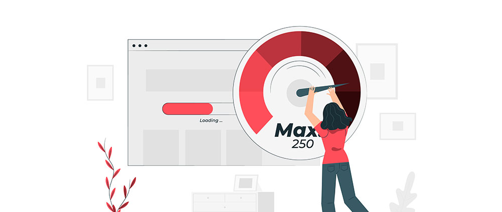
Research from Kissmetrics found that 47% of consumers expect a web page to load in 2 seconds or less and 40% of consumers abandon a website that takes more than 3 seconds to load. When it comes to designing your website and landing pages, you must keep an eye on the images that are too bulky in size. They might look and feel good but they directly affect the web page loading speed. Hence, they can pose more harm than good for your sales.
Questions to be Answered: Does the loading speed of your sales pages, product pages, cart pages, and checkout pages are optimized? Lowering page load speeds help in the survival of your website and it is an ongoing effort.
Tip 5: Enhance your Website Design
Come up with a layout that is intuitive enough to help your prospects understand the flow of your page and specifies clear CTAs. All these together help your prospects to take actions that boost the sales of your website. Remember, your website design should be in such a way that it allows the content and products to stand out.
Also, if your forms have too many fields to fill, the buying process is too long, and fields are difficult to comprehend, you will have a negative impact on your sales.
UI/UXUI/UXUser interface design or user interface engineering is the design of user interfaces for machines and software, such as computers, home appliances, mobile devices, and other electronic devices, with the focus on maximizing usability and the user experience. design for any website including E-commercee-commercee-commerce is the activity of electronically buying or selling products on online services or over the Internet. platforms should have enough white space to present a clean UI and is easy to navigate (checkout pages, address selection, etc.). Place CTA buttons in such a way so that it is easy for your prospects to find them. Moreover, product descriptions and reviews are to be clear and visible.
Questions to be Answered: Does the design provide critical elements in place for a prospect that is progressing through the sales funnel and reaching a conversion? Review your website design and its structure and ensure it does.
Bonus Tip: Analyze Your Sign Up Forms
The common elements to test are as follow:
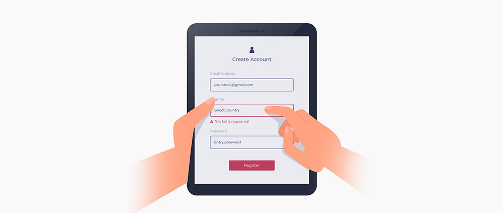
Your form can generate more conversions when you do A/B tests with it and implement the insights you gather from them.
- Headlines – A/B testA/B testA/B testing is a user experience research methodology. A/B tests consist of a randomized experiment with two variants, A and B. It includes application of statistical hypothesis testing or "two-sample hypothesis testing" as used in the field of statistics. your forms’ headlines to check which copy works better and drives more conversion.
- Text Box (Form fields) Copies – Ensure the form field copies are clear and concise. If it is unclear, you might drive away visitors.
- Text Box Placement – Test the placement of your fields by rearranging their orders to infer which arrangement results in better conversion overall.
- Text Boxes per Page – Keep a track of your completion rate to understand the ideal number of fields that boost conversion rate. You can collect more information later on as well. Also, fewer fields don’t always guarantee a higher conversion rate.
- Captcha – Captcha filters help in avoiding scammers but when they are difficult to read, it affects conversion.
Final Thoughts
Once you start implementing these tips and tricks, you can:
- Analyze your website’s friction points that result in exits (higher bounce rate on a landing page, cart abandonment, etc.)
- Qualify your visitors at different stages of their journey
- Optimize your conversion funnel that increases conversions
We, at TechAffinity, have expert UX strategists and marketers that study and analyze the visitor journey and help in building a perfect website, product page, landing page, checkout page, and cart page. Line up your queries to media@techaffinity.com or get in touch by scheduling a meeting with our experts.
