Responsive Web Design – What is It & Why It is Important?

Author : TechAffinity 2nd Jul 2015
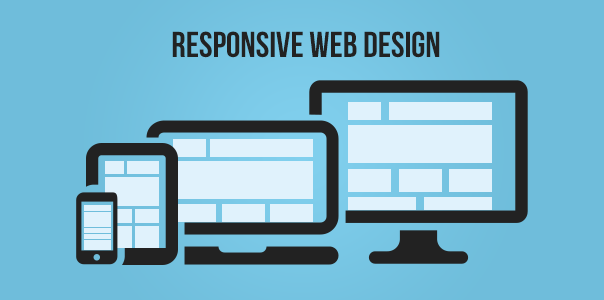
Responsive design has been the buzz word for quite some time now and should be a prerogative for any customer while developing their Web projects. Responsive web design is the method that allows websites to render itself across all devices irrespective of any UI form factors. So let’s look at it from a development folk’s perspective as in how this could be achieved.
Two important elements for any responsive web design would be:
- Fluid Grid system
- Media query
Grid System:
Usually, the width of a Website is represented as PX, for a fluid grid system one will have to use the below formula to identify the exact percentage for their website.

Target / Context x 100 = Result
For example if we are using website 980px, for the resolution 1336px then the percentage for the website will be calculated as below.
980/1336 x 100=73% approx.
HTML frameworks like Bootstrap and Foundation play a key role to predefine the grid system for desktop, tablets and other smartphone devices.
Bootstrap uses specific classes to define the fluid grid system.
- Desktop/Large devices col-md-*/col-lg-*
- Tablet col-sm-*
- Mobile devices col-xs-*
Media query:
Media query allows css to apply specific width/height to achieve responsive layout across devices.
@media screen and (min-width: 500px) {…}
Bootstrap uses 3 media query break point to achieve all devices compatibility. Below is a sample syntax which would explain better.
/* Extra small devices (phones, less than 768px) */
/* No media query since this is the default in Bootstrap */
/* Small devices (tablets, 768px and up) */
@media (min-width: @screen-sm-min) {…}
/* Medium devices (desktops, 992px and up) */
@media (min-width: @screen-md-min) {…}
/* Large devices (large desktops, 1200px and up) */
@media (min-width: @screen-lg-min) {…}
TechAffinity a Technology driven company over a decade long experience in this field and being one of the Pioneers to adapt to responsive Frameworks like Bootstrap, Foundation, Pure with expertise in various other technologies like .Net, Java, Mobile, PHP, RoR, Python etc,. We could address any of your IT needs in the best quality and in a cost efficient manner.
Still confused on responsive Web Designs? STAY IN TOUCH with us for a free consultation.