Responsive Testing Tools

Author : TechAffinity 4th Apr 2017
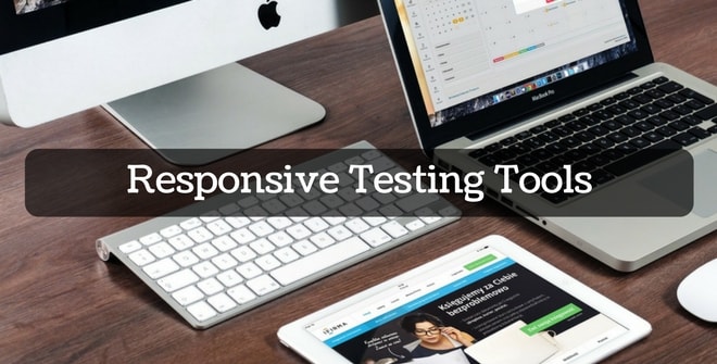
Web designing as an industry has evolved over the years and has adapted to all the technological changes happening worldwide. Initially, websites were viewed only on a desktop computer and then came the laptops. In the last 2 decades countries have embraced the idea of mobility with open arms. Now in most of the developing and developed countries majority of the population are accessing websites using their Smartphone. Websites which were originally designed for the dimension of a desktop screen were not user-friendly on a small mobile screen. This led to the need for a responsive design and responsive testing tools.
When a website is responsive, it adapts or changes based on the screen size it is being accessed from. The layout of a responsive website looks completely different on a laptop compared to mobile. Basically, there are 4 different screen sizes that are being defined in the responsive design analogy. They are
- Large screen desktops
- Medium-Screen Laptops
- Tablets/iPads
- Smartphones
One can define each screen size and vary the design layout accordingly. The same website, when viewed on different devices, will render the content in a layout that is suitable for that device screen.
This is a simple website where you can input your website URL and it will be rendered on all device sizes simultaneously for your review. This also includes iPad-Landscape.
This website provides you output in 10 different device sizes at the same time. This is extremely useful and also support 11-inch Macbook Air.
This is another cool tool to test the responsiveness of your website on a mobile device. It provides output in various small screen devices size both portrait and landscape modes.
This site has got a bookmarklet tool for your web browser. Once installed, you can test the responsiveness of any website just by clicking the bookmarks. Another useful feature of this tool is to test the responsiveness of local websites and take screenshots of them during the development process.
This is a mobile emulator tool where you can preview and take screenshots of your website on all popular mobile device brands. Since they support each brand and model, it gives you a more accurate output.
You can test the output of your responsive website on all device sizes including that of television and take screenshots.
You can perform responsive test by entering your website URL and test the output in all screen sizes. In addition to that, you can also enter your dimension manually test the website display.
This is a bookmark tool which lets you test the responsiveness of any website while you are surfing. You can use media queries to generate specific output sizes.
This is more of a tool which you need to download to test the responsiveness. This tool is significant because it works offline and supports most of the development of IDEs. You can check for responsiveness at the time of development and also at the time of debugging. You can also take screenshots and record your screen as a video.
Listed above are some of the tools for testing the responsiveness of your website on various device sizes.