4 CSS Layouts to Build Responsive Websites Without Media Queries

Author : Harry 4th May 2020
As a front-end developer, you might think you need media queries to develop responsive websites. But the fact is, you can still achieve it in the absence of a media query. Wondering how? With Grid & Flexbox, you can certainly make responsive websites without specifying media query breakpoints. Okay, let’s dive into the CSSCSSCascading Style Sheets is a style sheet language used for describing the presentation of a document written in a markup language like HTML. CSS is a cornerstone technology of the World Wide Web, alongside HTML and JavaScript. properties first.
By default, HTMLHTMLHypertext Markup Language is the standard markup language for documents designed to be displayed in a web browser. It can be assisted by technologies such as Cascading Style Sheets and scripting languages such as JavaScript. doesn’t come with any wrapper or container elements. So, if you want to use this method, you have to label all the elements of these input fields.
<form>
  <input type="text" placeholder="Name" />
  <input type="email" placeholder="Email Address" />
  <input type="submit" value="Subscribe" />
</form>
form {
display: flex;
flex-wrap: wrap;
& > input {
flex: 1 1 10ch;
margin: 0.5rem;
&[type='email'] {
flex: 3 1 30ch;
}
}
}
How is it Possible with CSS?
Form: To give form the flex layout, the display property of the form is set to flex (display: flex). Because by default, it would be in a horizontal flex layout where all items arrange in a single row.
Also, we have added “flex-wrap: wrap.” This is to specify that if the elements can’t fit in a single row, then the flex layout can wrap into several rows.
Inputs: The integral part of this technique is the flex property on the inputs. Here 3 values have been assigned to flex (1 1 10ch), which is the shorthand for 3 css properties that are given below:
- flex-grow
- flex-shrink
- flex-basis
Whenever and wherever there is an existence of unwanted space around the surrounding element, you can use flex-grow. It takes either a positive number or zero. This number indicates the total part an element takes.
For better understanding, let’s take a look at an illustration. Consider there are 2 elements, and both having flex-grow:1. The width of both the individual elements is ½ of the total width. When the 2nd element has flex-grown: 2, then the total number of parts would be 3 (1+2). Then the 1st element will be 1/3rd and 2nd element would be 2/3rd of the total width.
Flex-shrink works the same as flex-grow, but the only difference is, it is used when there is only a minimal amount of space than the element actually needs. If the elements combine together and occupy more space than the available, then their flexibility would be set to shrink or set to grow. This is one of the useful factors which you must know when working with flex layouts.
In the above layout, the flex-wrap is set to “wrap”. By doing that, the flexibility will never be set to shrink. Rather the elements will adapt to the next row just in case they don’t fit in.
In the above example, I’ve simplified the process by assigning a little amount of value to flex-grow. This works only when the last property, flex-basis, is assigned to zero. In default, flex-basis is set to auto, which makes the process a little difficult.
If flex-basis is set to auto, then the number assigned for flex-shrink and flex-grow will also affect the width of the element. It may be an implicit width or an explicit width. If one of the two elements has more content, then both the elements with flex-grow:1 might not be equally wide.
If you prefer to assign a value to flex-basis, you can still go on with it. In that case, the same value has to be set to the initial size of an element. In our case, both the name and button fields get the same value (10ch), and the email field is set to 30ch.
Initially, the width of both the name field and button are set to 10ch, and the email field is set to 30ch. Since it is a flex layout, the value of the flex-basis is considered as the initial point for flex-shrink or flex-grow value. Consider it as a multiplier for the flex-basis value.
For both the name field and button, the value assigned for flex-grow and flex-shrink is 1, and for flex-basis is 10ch. And for email fields, flex-grow is set to 3, flex-shrink is set to 1, and flex-basis is set to 30ch.
In a nutshell, compared to other fields, email starts triple the times wider, and grows three times faster, but shrinks at the same value.
Four Types of Layouts
Now, let’s see the types of layouts and their functionalities. Let’s begin with the smallest layout.
1. The Smallest Layout:
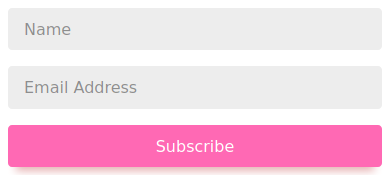
Scenario: All the three elements are aligned vertically.
Here, there is no adequate amount of space to allocate all the three elements in the same row. Their total values are 50ch wide, 10+30+10. It’s not even possible to stack two elements in a row. As a result, all the elements are wrapped one after the other.
Flex-grow value is positive for all the three elements, and they don’t share their row with others. Hence, all the three elements grow to the fullest extent of their own row.
2. The Second Layout
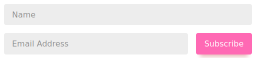
Scenario: The name field occupies a full row, whereas the email field and CTACTACall to action is a marketing term for any device designed to prompt an immediate response or encourage an immediate sale. A CTA most often refers to the use of words or phrases that can be incorporated into sales scripts, advertising messages or web pages that encourage consumers to take prompt action. button are wrapped in a single row.
There is not enough space available to accommodate all the three. Hence, the email field gets pushed to the next row. Here comes the interesting part. Despite both the name and button field having the same flex values, the number of characters present in the button is different from the name field.
Due to different flex values, it is not possible to wrap both the name and email field in a single row. Because of small differences, both email and button got fitted in the same row.
Due to flex-grow, the name field completely occupied the first row. The second row is large enough to accommodate both email and button. So, we leveraged flex-grow to wrap them in a single row.
Important Note: This layout wouldn’t be possible, if the last element was not a button.
3. The Third Layout
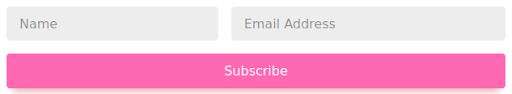
Scenario: Both the name and email field are wrapped in the same row and leaves the button in the next row
Here due to lack of space, both the name and email are wrapped in the same row, and the button is pushed to the next one.
The name and email field shared the first row in their flex-grow/flex-basis ratio, and the CTA button completely occupied the second row.
4. The Fourth Layout

Scenario: This layout is the simplest of all. The width of the row is wider than all the three elements. Hence, all three elements are wrapped in a single row
You might think the size of the button should be as large as a name field since both have the same flex value. But as we discussed in the second layout, the button character size is less wide, so it ends up being smaller and stuck in the first row.
This is how CSS Flexbox helps in dealing with responsiveness without using CSS Media Queries and makes it easier for developers to build responsive websites. At TechAffinity, our expert front-end developers are known for designing responsive websites quickly and professionally. If you have further queries, feel free to mail us at media@techaffinity.com, or you can schedule a meeting.