7 Website Design Best Practices You Should Follow

Author : Arul Selvan 10th Feb 2021

It’s easy to get a website up and running nowadays as anyone can create a basic website with readymade templates. What really matters is to garner a visitor’s attention and without a unique and clean design, it will be really difficult to keep a visitor engaged with your website. If you ever wonder why a website’s design matters here’s a stat for you!
“It takes just 0.05 seconds for users to form an opinion whether or not to stay on your website”
We’ve created a checklist that can be used to ensure your website meets all the design principles to keep the users engaged on your site pages.
1. Fix your target audience
Before you start working on your website, you need to understand your target audience so that you can create a design and theme that’ll work for your audience. The best practice is to do research on your target audience and collect some basic information such as below
- Age
- Their buying habit
- Location
- Income and spending pattern
- Occupation
- Hobbies or Interests
With that said, you also have to understand that your overall customer demographics information collected will not match your target audience exactly but this exercise will at least help you understand who’s buying and how they make a purchase.

2. Reduce options or the number of choices you offer
A good website design should not offer so many choices to a user. The more choices you offer the more time it is going to take for a user to arrive at a decision. Here’s where your team has to put so much thought to figure out the number of CTAs that are going to be used in a website design.
3. Follow standards
For everything you do on your website, it’s always good to follow the standards. Below are some of the basic web design standards which a designer should follow before finalizing the complete design.
- Logo should be placed on the top left
- Contact number should be placed at the top right
- Main navigation should be placed at the header in the top
- CTAs should be high up on the home page
- Add a signup box in the footer
- Social media icons should be placed at the bottom
4. Finalize your style guide
Start working on a style guide as you discuss your site’s design plan. A style guide will help you maintain a consistent brand image across your website as well as other promotional materials. Below are some of the key areas you have to work on while preparing your style guide.
- A clean logo
- A unique color palette for your website
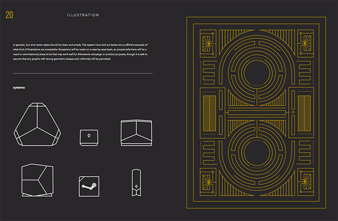
- Gather elements such as icons, vector images, and photos that’ll be utilized across your website
- Font style and color

5. Design an effective layout for different page types
Design trends change now and then but a clean and neat UI pattern will work for years to come and it is timeless. Below are some of the web layout principles that should be followed to create a timeless classic UI pattern
- Adhere to split-screen layouts
- Use big typography as it will make your content readable and improve the user experience.
- Use a personalized layout to make your customer’s experience better
- Use a clear content layout
- Use whitespace to ensure that you keep your visitor’s attention on the important features of your website
6. Ensure your website is mobile responsive
Creating a mobile responsive website should be at the top of your checklist if you wanted to reach more and more people online. Google reported that
“74% of people say they’re more likely to return to a website in the future if the site is well optimized for mobile”
A poorly designed website will lead your website visitors to look at other options available in the market and in most cases, they will reach your competitor’s website to make a purchase. So if you are not looking at mobile responsiveness right now, you are already missing a lot of potential business opportunities. A mobile responsive website will also help you to increase user engagement and drive more conversions for your business.
7. Prioritize SEO
Everything you do on your website should yield business-oriented results and in order to achieve that start prioritizing SEO. SEO is not just about adding keywords. It has a lot to do with how you design your website and the thoughts you put behind every element of your website. Some of the basic strategies you have to follow to improve your website’s performance are as below
- Do keyword research and implement a content strategy to rank for the keywords you want
- Create a unique and SEO oriented site design
- Focus on readability and create the best piece of content for your target keyword
- Focus on site loading speed
- Generate quality backlinks
- Optimize your images with descriptive alt text
SEO is an ongoing process and you have to keep a track of how your website performs on search engines and implement any necessary changes needed to stay with the trend.
Conclusion
The way you design your website will ultimately determine the success of your business in this Internet era. You also have to remember that every website is a work in progress and there will always be scope for improvement with changing trends. We, at TechAffinity, have more than 20 years of experience in building creative and result-oriented websites. Feel free to share your project ideas with our experts by sending an email to media@techaffinity.com or schedule a meeting with us to discuss your project.
