An Overview of CSS Grid with Example Front-End Codes

Author : John Prabhu 6th Aug 2020
CSS Grid has redefined the front-end development and has taken web development to the next level. Let’s go a step ahead from the basics to advanced examples and tweak the front-end HTML elements further with CSS Grid.
What is Grid?
CSS Grid helps in writing quick and efficient layouts using the in-browser grid capabilities. Before the arrival of CSSCSSCascading Style Sheets is a style sheet language used for describing the presentation of a document written in a markup language like HTML. CSS is a cornerstone technology of the World Wide Web, alongside HTML and JavaScript. Grid, you need to devise your custom grid system or go with front-end frameworks such as BootstrapBootstrapBootstrap is a free and open-source CSS framework directed at responsive, mobile-first front-end web development. It contains CSS- and JavaScript-based design templates for typography, forms, buttons, navigation, and other interface components.. Though you can rely on frameworks, CSS Grid makes front-end development even easier while developing simple and complex layouts.
Basic Terminologies
The basic terms associated with CSS Grid are as follows:
Columns
Rows
Cells
Grid Lines
Gutter
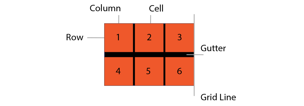
All the above terms are explained in the diagram. This diagram shows a 3×2 column grid, which means 3 columns and 2 rows.
Example Layout
Using the above-discussed concepts, let’s build an example layout as shown below:
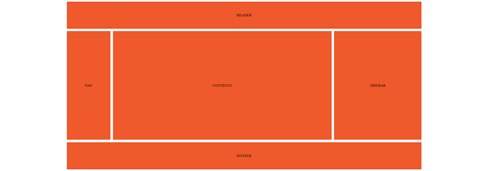
In the above layout, there are totally 3 layouts: Header, Footer, and Center Sections. The center section is further divided into 3 columns: Nav in the first column, main content area in the second column and sidebar on the third column.
Here is the sample HTML for this example.
<div class="wrapper">
  <header class="items">HEADER</header>
  <nav class="items">NAV</nav>
  <div class="items contents">CONTENTS</div>
  <aside class="items">SIDEBAR</aside>
  <footer class="items">FOOTER</footer>
</div>
As we’re clear with the HTMLHTMLHypertext Markup Language is the standard markup language for documents designed to be displayed in a web browser. It can be assisted by technologies such as Cascading Style Sheets and scripting languages such as JavaScript. markup of our essential elements, let’s start styling the. Since basic styling and layouts differ from each other, you can do the basic styling based on your personal preference.
See the Pen 1. CSS Grid by Hanush (@hanushk) on CodePen.
In the above example, we are styling all the elements inside a wrapper containersContainersContainers make it simple for developers to know that their software will run, no matter where it is deployed and enable microservices. Instead of having one large app, microservices break down apps into multiple small parts that talk to each other.. Further, we’re setting the background color to #ef592b and it varies depending on the brand preferences. The value of the display property is set to “flex” because we need to set the align-items and justify-content properties to center in order to achieve the desired layout. Also, the bottom and right margin are set to 1px for proper alignment.

Next, let’s get into the CSS Grid part of it.
See the Pen 2. CSS Grid by Hanush (@hanushk) on CodePen.
In the above code, you can see the display property is set to grid and that is how a container is converted into grid. Also note that .wrapper * is different from .wrapper.
As we’ve defined the display property to grid, we can now focus on styling the columns and rows using grid-template-columns and grid-template-rows properties. With the help of grid-template-columns property, you can the number columns and the desired width of the column. With the help of grid-template-rows, you set the number of rows and its height.
As you can see from the above example, the first column took 1 fraction of the total columns, the second column took 5 fractions of the total columns, and the third column took 2 fractions of the total columns. A single fraction unit means “one piece of however many pieces we are splitting this into”.
It is evident that the same procedure applies for the rows as well. There are 3 rows and the first row contains the header that takes the entire row across all three columns. The second row takes the nav, contents, and sidebar. Finally, the third row contains the footer and just like the first row, it takes up all the three columns.
Hence, the first and the last rows take up the same amount of height (5 fractions) and the center takes up the rest of the remaining height (20 fractions).
Next, we’ve created a gutter of 10px using grid-gap property and set the height of our wrapper to 720px. You can cross-verify these details using the above Codepen snippet and screenshot.
Further, we can style the header and footer with some properties such as grid-column-start and grid-column-end properties to get the desired results. Using these properties, we will instruct the header and footer to make use of the space available in the entire row. Here’s an example code:
See the Pen 3. CSS Grid by Hanush (@hanushk) on CodePen.
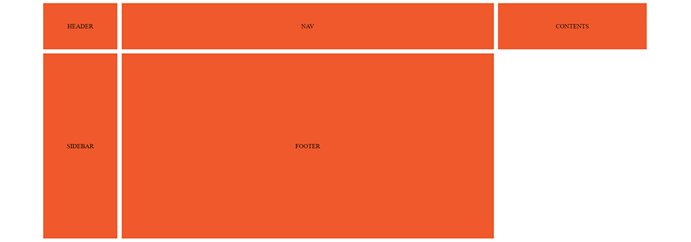
From the above example, it is evident that both the header and footer start from grid line 1 and end at grid line 4. As a result, they take up the entire space available in the entire row and the output is as shown below.
Full Code:
Wrapping Up
CSS Grid is a powerful way to design the layouts of your web project’s front-end. It works exceptionally well while creating both websites and web apps and helps you get rid of frameworks for the sake of responsive design. Understanding CSS Grid lines, rows, columns, gutter, and cells help with seamless front-end development.
Also Read: CSS Grid Containers
We, at TechAffinity, have expert front-end developers who are capable of handling web projects of any complexity and build intuitive designs. For more information on front-end development and CSS Grid, feel free to send an email to media@techaffinity.com or schedule a meeting with our experts.