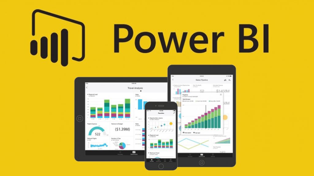
Data Visualization Using PowerBI

Author : Amarnath S 27th Jan 2023

Power BI – it is a software product developed and owned by Microsoft with the purpose of focusing on Business intelligence, basically it is an interactive data visualization tool/Software. PowerBI is a major component of the Microsoft Power Platform.
Power BI is fundamentally a new and useful tool for enterprise level business companies that are in a position and with a need for handling large amount of data and without a cost-effective tool to decode the insights from the data. It is a collection of applications, software services and integrators that seamlessly work together to manipulate and consolidate data from different sources into coherent, streamlined, and visually presentable form with visually interactive insights. The data required for the Power BI tool can be fetched may be input by reading directly from a webpage database, or structured files from CSV, Excel, XML, and JSON and form the Web Services or API’s as well for presenting a structured graphical report.

It’s is an on-demand business intelligence Tool used for Business Analytics. By implementing the Power BI, the system owner gets the real-time insights, works with data from different sources and converts it by manipulating the data into a graphical report, graph or dashboard. This tool is quick in data manipulation, it is open-source, and highly intuitive business intelligence Tool which does not need any kind of technical knowledge or IT support.
Data visualization is utilized for demonstrating the performance Metrics intuitively, trends in communication, the impacts on implementing the new strategies and mapping the data concurrence in graphical means. These representations can be powerful tools for understanding the trends in the market and also in the businesses and empowering higher values to reports and applications.
The reports with stunning uncompromised rich visuals can be an efficient tool for exchanging ideas, hence the ultimate benefit of the data visualization is its ability to arrive at better decisions. Data visualization also helps the businesses to arrive at strategic decision making.
Through the transactional, interaction and the behavioural data in the system and through the external sources such as API, Power BI manipulates and provides the visibility on the broader context and actual scenario. Finally through the Data visualization, one can predict the trends and patterns through the available data which is not at all possible with mere numbers. Hence data visualization not only shows the reports in graphical way, it gives a clear idea to take decisions as well. The visual clarity offered by the Power BI helps the business owner to identify the insights to take better decisions, elevate the accuracy in their planning and strategies. The main advantage of the data visualization is that it helps to lay better baseline and foundations which route them in a better path to reach their success. The different Power BI Chart types or the visuals to empower the data visualization are Area charts, Line and Bar charts, Column charts, combo charts, Pie and doughnut charts, gauge, funnel, scatter, bubble, and waterfall charts, Slicers, matrix charts. Regional, Point and Flow maps also available with it.
Custom visuals can be created by using the custom visuals SDK which enables the business owners to access their available data in a manipulated way that helps to drive the business at its best.
There are scenarios and examples where the data visualization using Power BI brings a clear statistics and picture about the actual happenings which is very much required for taking decisions i.e. Post reporting actions based on the reports. For instance people initiating vaccinations during a pandemic by country and respective to the regions can be very well shown in a graphical way using Power BI, by this the percentage of vaccination initiations respective to the country and date are clearly visible. Furthermore, the subsequent micro level graphical reports such the Pandemic progress to zero, i.e. the declining of the previously recorded peak, Spread analysis, Testing reports and risk analysis.
There are other scenarios where the Power BI data visualization plays a vital role by bringing crystal clear graphical reports for global retrospective actions such as manipulating the global data to display the electricity access to the countries in the world and the improvement in the sector around the world for past 3 decades. In the share market related applications, Power BI reports plays a vital role for displaying the real time graphical reports which is more efficient for the investors to take their decisions and also the reports can be shared among the Power BI users. Hence the secure data analytics in business is possible through the Power BI implementation.
Final Thoughts
We at TechAffinity, have experts who are well versed and have worked on the PowerBI. In the past, our team has successfully implemented the PowerBI data visualization in our client’s projects which worked seamlessly.
